What’s the best size for blog post images for WordPress? The ideal size depends on your theme layout, but a widely recommended dimension is 1200×675 pixels for full-width images. This size offers a balance between visual quality and fast loading—two things WordPress users care about most.
Visuals make your content stand out, but using improperly sized files can sabotage performance. Pixel dimensions matter more than you might think—because WordPress automatically generates multiple image sizes behind the scenes, and those auto-scaled versions rely heavily on the original you upload.
If your image is too large, it slows your site. If it’s too small, it looks blurry on high-resolution screens. That’s why selecting the right size from the start is critical.
Single-column themes often look best with images around 1200×675, while two-column layouts perform well with sizes like 680×382. These options keep your pages fast without sacrificing quality.
File weight also matters—heavier images take longer to load, frustrating users and hurting your SEO. Choosing the right dimensions is step one in keeping both people and search engines happy.
Table of Contents
ToggleKey Takeaways
- WordPress creates multiple image versions during uploads for different display needs
- Dimensions (pixels) and file size (bytes) impact performance differently
- Recommended sizes: 1200×675 (single column) and 680×382 (two columns)
- Properly sized images improve loading speeds by up to 50%
- Visual optimization boosts SEO through better user experience metrics
- Balancing quality and file weight prevents mobile display issues
Introduction to WordPress Image Sizes
Uploading visuals activates hidden optimization processes. The platform generates thumbnail, medium, and large copies automatically—each serving specific display needs across your site.
- Thumbnail: 150×150 pixels (ideal for grids)
- Medium: 300×300 pixels (suits sidebars)
- Large: 1024×1024 pixels (optimizes featured content)
File formats matter. JPEGs compress colorful photographs efficiently, while PNGs maintain crisp edges in graphics. Selecting the right type slashes file weight without visible quality loss.
Properly scaled media cuts loading times by 30-40%. Faster pages improve user retention and SEO rankings through enhanced performance metrics like Largest Contentful Paint.
Your theme uses these auto-generated files to adapt visuals for mobile screens, archive layouts, and post headers. This behind-the-scenes resizing ensures sharp displays across devices.
Understanding Default Image Sizes and Media Settings
Your WordPress dashboard holds the key to balancing visual quality with technical precision. Three default presets shape how your content appears: thumbnail (150×150), medium (300×300), and large (1024×1024). These hidden workhorses determine how crisp your visuals look in widgets, galleries, and featured sections.
Overview of WordPress Media Settings
Navigate to Settings → Media to control baseline dimensions. Adjusting these numbers affects future uploads—existing files remain unchanged unless regenerated. Most users benefit from increasing medium sizes to 450×450 for better mobile displays.
Theme developers often add custom dimensions beyond these defaults. These hidden variations explain why uploaded visuals sometimes appear cropped unexpectedly in sliders or archive grids. Check your theme’s documentation for specific requirements before adjusting core settings.
Theme-Specific Image Requirements
Premium templates frequently create 5-10 additional sizes automatically. You’ll find these extra files in your /wp-content/uploads/ folder through hosting tools like cPanel’s File Manager. Matching your original uploads to these specifications prevents blurry scaling during theme updates.
For portfolio sites, some templates demand square ratios (1:1) for gallery consistency. News-oriented themes might require landscape formats (16:9) for featured articles. Always cross-reference your theme’s image guidelines with WordPress’ default media settings for optimal results.
What’s the Best Size for Blog Post Images for WordPress
Your theme’s framework dictates how visitors perceive visuals. Single-column designs demand 1200×675 pixel files that fill screen widths without distortion. Multi-column grids thrive with 680×382 pixel assets that align with sidebar elements.
Matching Dimensions to Design Patterns
Analyze your theme’s structure using browser developer tools. Right-click any page element and select “Inspect” to view content area widths. This reveals whether you’re working with spacious single-column formats or compact multi-pane layouts.
Landscape-oriented graphics (16:9 ratio) dominate modern articles, but portrait shots (4:5) work for tutorials showing vertical processes. Square formats (1:1) create visual breaks in long-form content. Pro tip: Maintain 72 PPI resolution for web displays to prevent unnecessary file bloat.
News portals often standardize widths across articles for brand consistency. Lifestyle blogs might vary dimensions to emphasize key sections. Your approach should balance aesthetic harmony with functional adaptability.
“Responsive design starts with understanding your canvas – the theme’s layout is your blueprint for visual decisions.”
Test different ratios using temporary draft posts before finalizing sizes. Most CMS platforms let you preview changes without publishing. This trial process helps identify cropping issues in galleries or sliders early.
Optimizing Image File Size and Website Performance
Digital landscapes demand precision—every byte impacts how visitors experience your content. Balancing visual quality with technical efficiency separates professional sites from sluggish competitors.
Balancing Dimensions with File Size
Pixel dimensions directly influence file weight. A 1200×675 JPEG at 72 PPI typically weighs 80-120KB, while the same dimensions in PNG format might double that size. Use these benchmarks:
- Photographs: JPEG (85% quality)
- Logos/Graphics: PNG-8 (limited colors)
- Screenshots: WebP (modern browsers)
Resize originals before uploading. Cropping within WordPress wastes bandwidth—your CMS still processes the full file. Tools like Squoosh reduce bytes without visible quality loss.
Compression Techniques and File Format Tips
Modern compression strips hidden data from files. Try these strategies:
- Enable lazy loading in WordPress
- Set maximum width/height in media settings
- Use CDNs for global delivery
JPEGs handle gradients better than PNGs. For graphics with text, PNG maintains sharp edges. Always preview compressed versions—sometimes 70% quality looks identical to 90% but cuts file weight by half.
“A 100KB reduction per image shaves 2 seconds off mobile load times on average.”
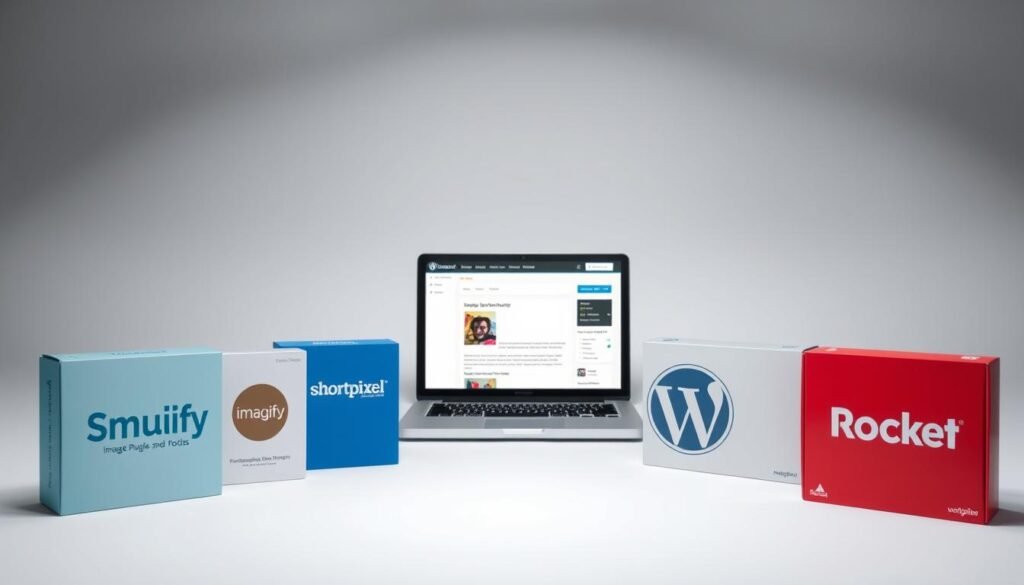
Automate optimization with plugins like ShortPixel. These tools batch-process existing media while enforcing size limits on new uploads. Pair this with caching solutions for cumulative speed gains.
Customizing Image Dimensions and WordPress Settings
Your website’s visual identity demands precise control—even after uploading files. WordPress offers native tools to refine media without external software. Let’s explore how to adjust visuals directly in your dashboard.
Editing Images Within the WordPress Media Library
Navigate to Media → Library and click any file to access editing features. The platform lets you:
- Resize pixel dimensions
- Crop to specific ratios
- Rotate or flip orientation
These tools work for quick fixes but lack advanced features like layer adjustments. For complex edits, use dedicated software before uploading. Changes apply only to the selected file—not automatically to theme-generated thumbnails.
Modify default presets under Settings → Media. Adjust width/height fields and click Save Changes to affect future uploads. Existing files require regeneration plugins to update all variants.
Built-in editing shines for minor tweaks: straightening crooked photos or trimming empty space. For brand consistency, create reusable templates in external tools and upload perfected files. This hybrid approach saves time while maintaining quality.
Leveraging Plugins and Tools for Image Optimization
Streamlining visual assets requires smart automation paired with precision editing. Specialized solutions handle technical heavy lifting while you focus on content creation. Let’s explore how to combine external editors with CMS-integrated tools for maximum efficiency.
Using Image Optimization Plugins Effectively
Modern plugins transform manual processes into background operations. ShortPixel Image Optimizer automatically reduces file weight during uploads, maintaining clarity while shaving off excess bytes. This happens without requiring technical expertise—set your preferred compression level and forget about manual adjustments.
Three essential tools enhance workflow efficiency:
- Canva: Create branded graphics using drag-and-drop templates
- Pixlr: Resize and crop directly in your browser
- GIMP: Advanced editing for custom visual effects
These applications integrate seamlessly with WordPress through direct uploads or media library imports. For ongoing optimization, plugins like Imagify apply lossless compression to existing files. This dual approach—external editing plus automated processing—ensures consistent performance across all devices.
“Automation plugins cut my image optimization time by 80% while improving site speed scores.” – WordPress Developer
Prioritize solutions matching your technical comfort. Beginners benefit from all-in-one plugins with preset configurations. Advanced users might combine multiple tools for granular control. Always test compressed files across devices to verify quality retention.
Ensuring Responsive Design and Device Adaptability
Modern websites must deliver flawless visuals on every screen. Responsive design ensures your images adapt to smartphones, tablets, and desktops without manual adjustments. This flexibility keeps your website professional while maintaining fast load times.
Strategies for Mobile and Desktop Image Display
Use 16:9 aspect ratios for critical elements like full-width backgrounds (1920×1080 pixels) and hero sections (1200×720 pixels). These proportions prevent distortion when screens shrink or expand. Test displays using Chrome DevTools’ device toolbar—it simulates how visuals render on iPhones, Androids, and laptops.
Prioritize visual harmony across platforms. A hero image might load a 800KB file on desktops but switch to a 300KB version for mobile. WordPress plugins like WP Rocket automate this process, serving optimized files based on detected devices.
“Responsive testing isn’t optional—50% of users abandon sites that break on their phones.”
Always check image edges on smaller screens. Text overlays might wrap awkwardly if not tested. Use vector formats for logos to ensure crisp scaling. These techniques preserve user experience while keeping your website competitive in search rankings.
Troubleshooting Image Issues and Upload Limits
Smooth image management often hits roadblocks when technical limits clash with creative needs. Hosting providers control upload restrictions—most cap files at 4MB to 128MB. Exceeding these thresholds triggers errors that stall content creation.
Resolving Upload Errors and Large File Concerns
When uploads fail, check your file size first. Contact your hosting provider for limit increases or edit server settings via .htaccess/php.ini files. Plugins like File Upload Limits bypass restrictions without coding—ideal for time-strapped users.
For massive graphics, use FTP/SFTP transfers. This method skips WordPress’ size checks while delivering files directly to your media library. Compress originals beforehand using tools like TinyPNG to maintain quality.
Managing Thumbnail and Featured Image Conflicts
Theme-specific requirements cause most display issues. Rectangular featured images (1200×687px) might crop awkwardly in square-focused templates. Always review your theme’s documentation for exact dimensions before uploading.
If thumbnails appear distorted, regenerate them using plugins like Force Regenerate Media. This rebuilds all image versions to match current settings. For persistent conflicts, create child themes to override default sizing rules without breaking core files.
Whether you’re starting a blog, launching an online store, or creating a business website, we’re here to help. We design fast, secure, and mobile-friendly WordPress websites tailored to your brand and goals.
🚀 Custom design
🔧 SEO-ready & easy to manage
🔒 Secure & optimized for performance
📩 Get in touch today and let’s bring your vision to life!

